Design Process
User Flow & Scope
Based on early research and interviews, I created a full user flow to clarify how users would navigate the tool. I led a team discussion to prioritize features using the Bullseye Framework, followed by a MoSCoW analysis. Together with our client, we defined the scope: deliver 30+ features, with “must-haves” going into a working MVP, “should-haves” as high-fidelity designs, and “could-haves” as wireframes.

Wireframes & User Testing 1
We started with rapid ideation using Crazy 8s, then voted and refined sketches into three layout directions. I turned these into interactive wireframes and conducted our first internal testing round at CDM. We explored layout preferences, writing tone, and visual hierarchy to inform early design choices.

Full Lo-Fi Wireframes
Building on testing feedback, I designed low-fidelity wireframes & Figma Prototype covering all features—ensuring clarity, consistency, and accessibility. These served as the foundation for design handoff and developer alignment. The client reviewed and approved this version before we moved to high-fidelity.


Collaboration with UI & Dev
Our UI designer translated wireframes into pixel-perfect high-fidelity designs. I worked closely with both the UI and development teams (using Figma and React) to ensure UX quality through consistent handoff, component breakdown, and design QA—especially around navigation, accessibility, and AI explanations.
User Testing 2 – Public Round
We conducted our second round of testing on-site at DigiBC with 49 participants. They interacted with the full website in a mini-clinic experience. Participants selected a character and completed tasks from uploading lab results to understanding flagged items and next steps.

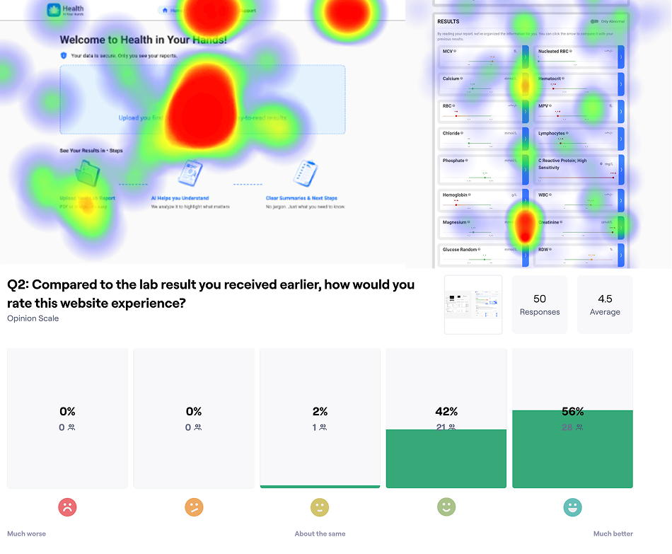
Analysis – What We Learned
We received overwhelmingly positive feedback:
- 4.5/5 preference for our website over paper reports
- Strong approval for layout, writing tone, and color-coded urgency
- Participants found results easy to read and next steps helpful
- Some concerns raised around trust in AI, highlighting the need for tone and boundaries
- Future usage rated at 4.3/5
Iteration Based on Insights
We quickly implemented key improvements: adding drag-and-drop upload, clearer hover icons, tone adjustments, and stronger accessibility features. This image shows just one of many UI iterations made to respond directly to real user needs.
This project is still ongoing. We’re currently in the final development phase, translating our high-fidelity designs into a fully functional MVP.