Design Process
Ideation
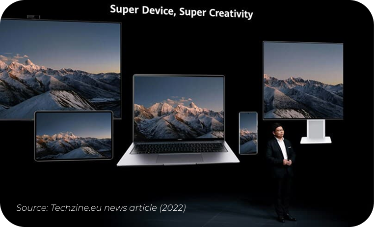
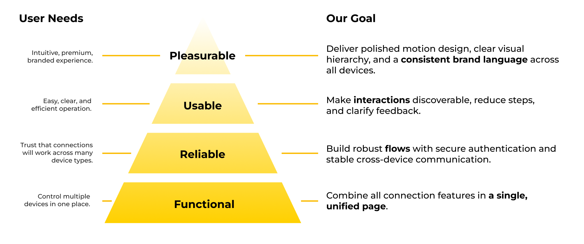
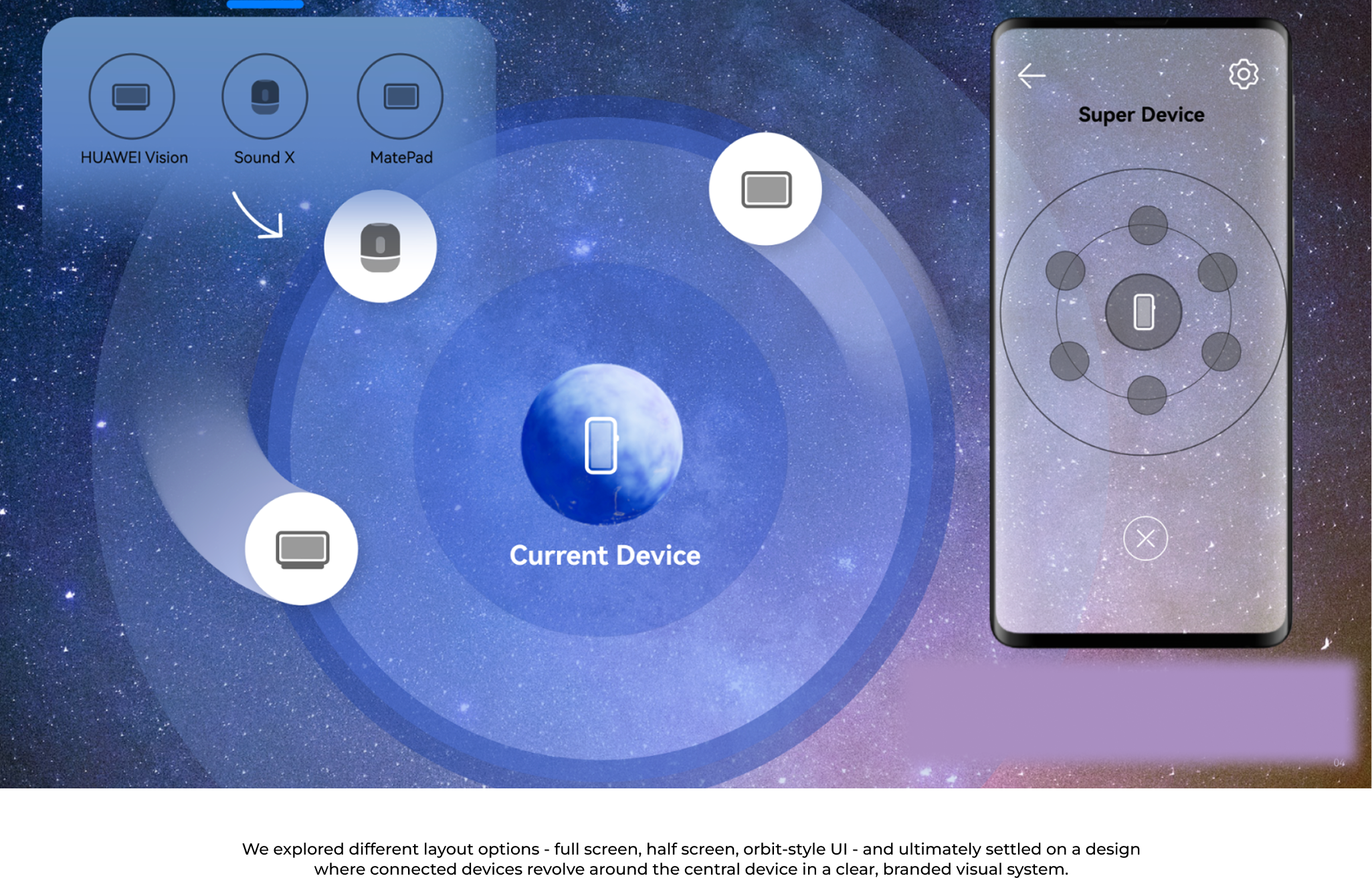
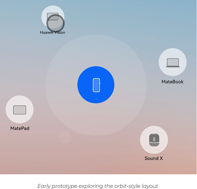
In the early stages of design, we explored ways to make the “Super Device” concept intuitive and easy to understand. We asked ourselves: How can we show that the current device is always the centre of control?
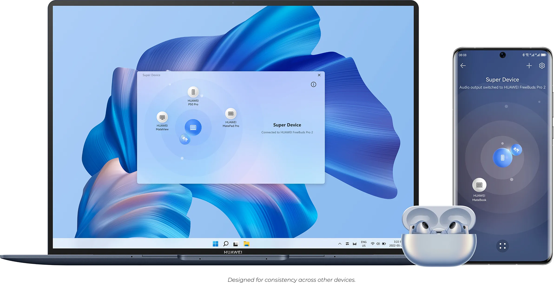
The idea of the universe inspired us - the current device as a central planet, with other devices orbiting around it. This metaphor felt like a natural, visual way to explain connection flows, so we began shaping the concept using this “universe model.”

Interaction Innovation
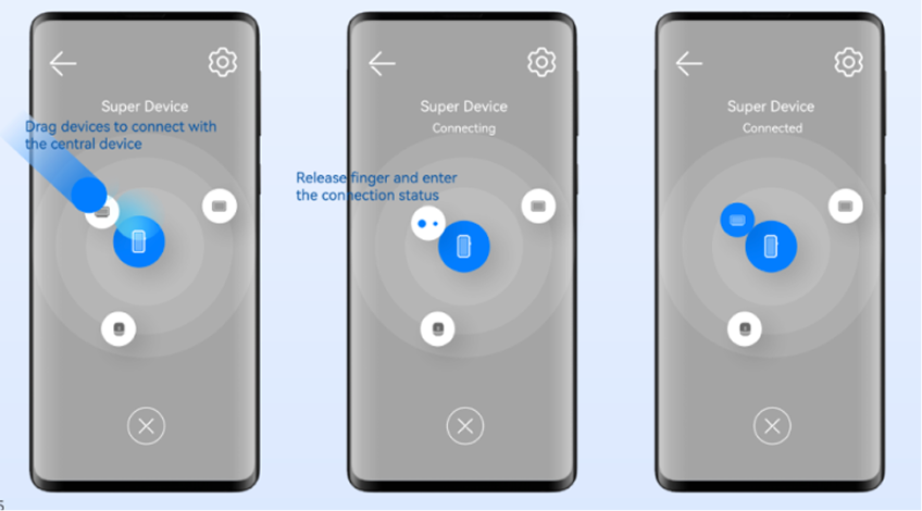
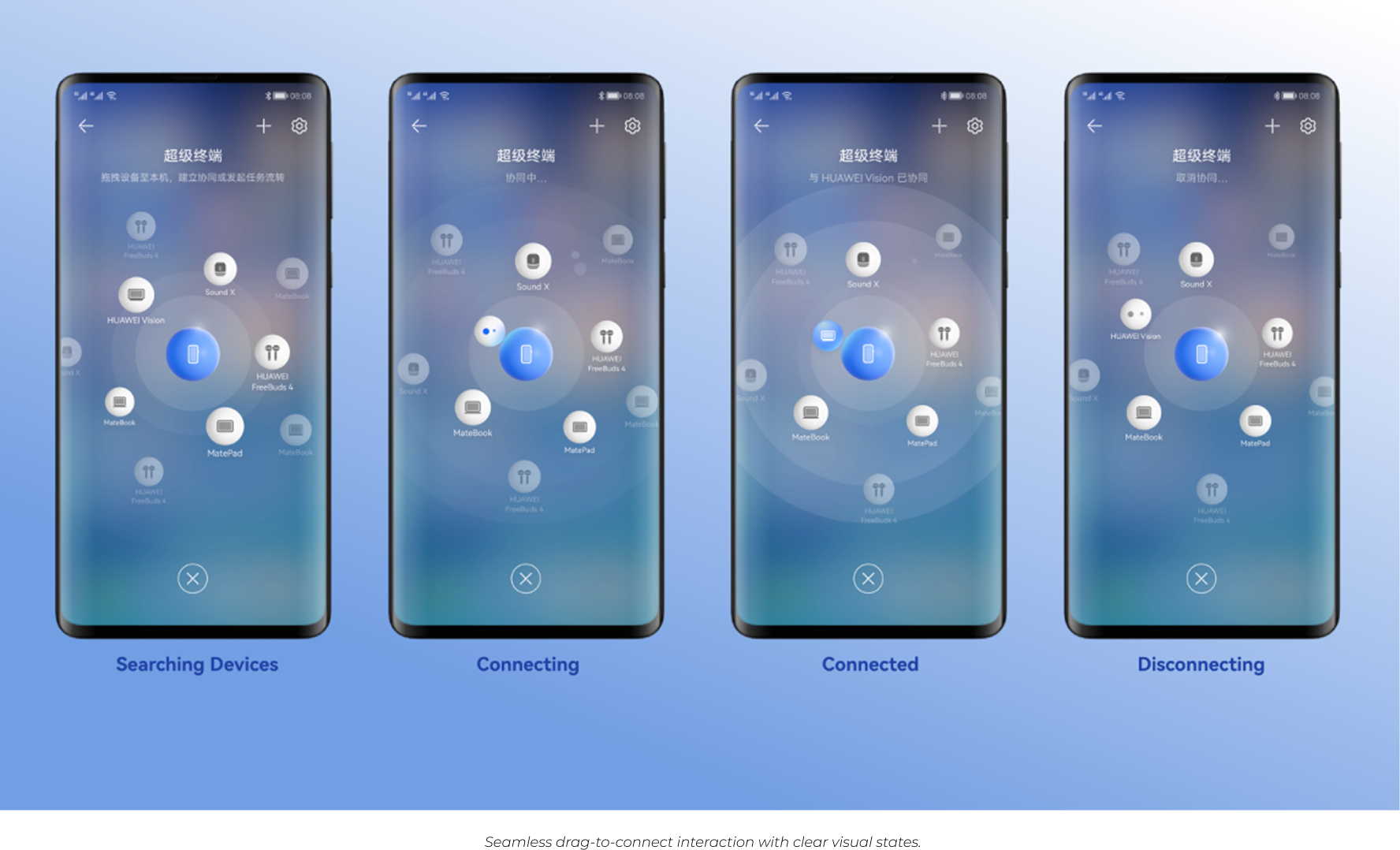
Once we landed on the “universe” concept, it was clear that simple tapping alone wouldn’t do it justice. We needed an interaction that felt natural and instinctive, making users feel they were truly “pulling” devices into orbit around their main device.
To test this, I prototyped drag interactions that let users directly pull devices toward the centre. I shared these videos with our UI designer, and we both felt this approach immediately made the experience clearer and more satisfying.
After multiple design reviews and rounds of stakeholder feedback, this drag-to-connect interaction was confirmed as a core part of the final experience.

Design Details
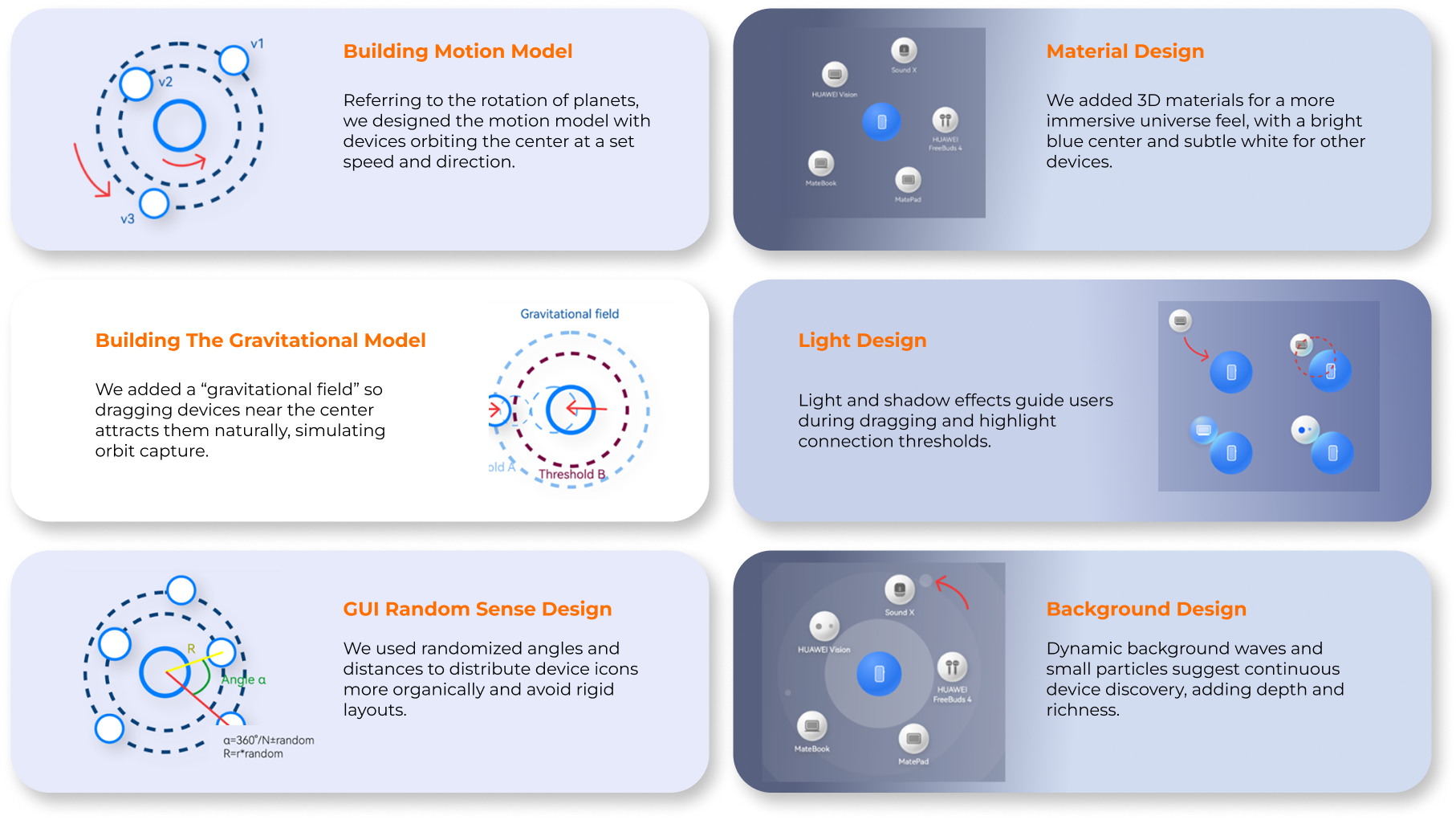
We refined multiple details - from motion, gravity, and distribution to material, lighting, and background -to make the experience feel natural and immersive.


Rethinking the Entry Point
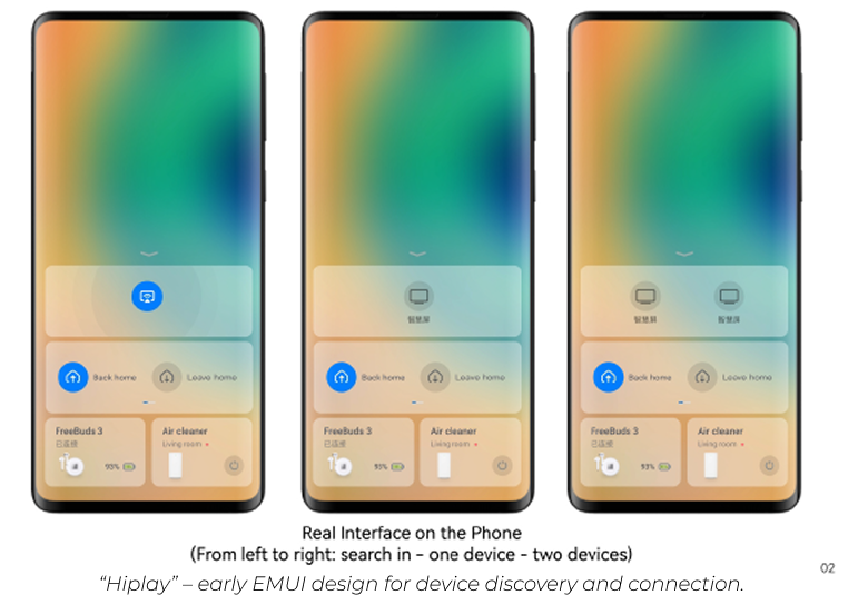
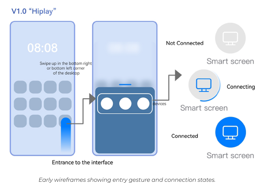
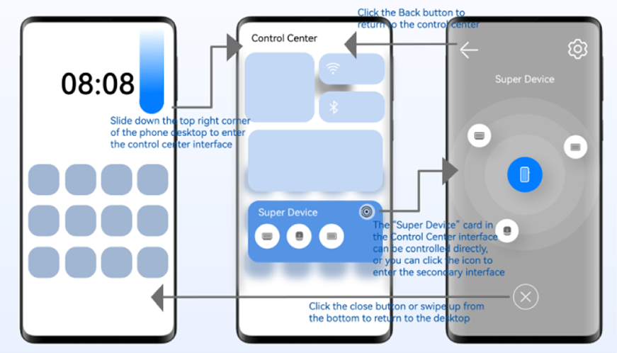
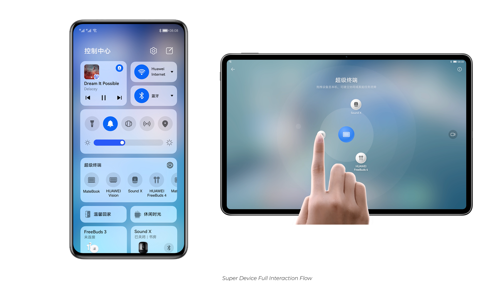
User testing revealed that the original bottom-corner swipe was awkward for one-handed use and prone to accidental triggers. To improve this, we moved the entry point to the Control Center, a familiar, high-frequency space that better matched user habits.
We also needed a full immersive page for the new universe model design. To bridge this, we added a simple card in the Control Center - retaining the familiar HiPlay style for quick controls while linking to the new, immersive orbit-style page.
User Testing & Research
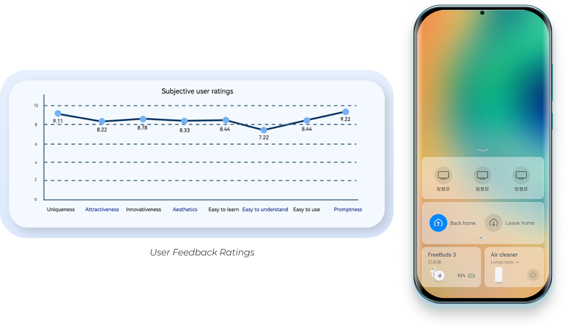
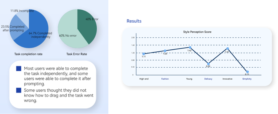
After launching this version with the new HarmonyOS (2020), our research team conducted usability testing to evaluate ease of use, intuitiveness, and aesthetic perception.
Key insights:
- Users described the new design as young, innovative, and high-end.
- Some users were unsure how to interact with it.
- Suggestions focused on improving visual clarity and interaction feedback.


Iteration & Design Improvements
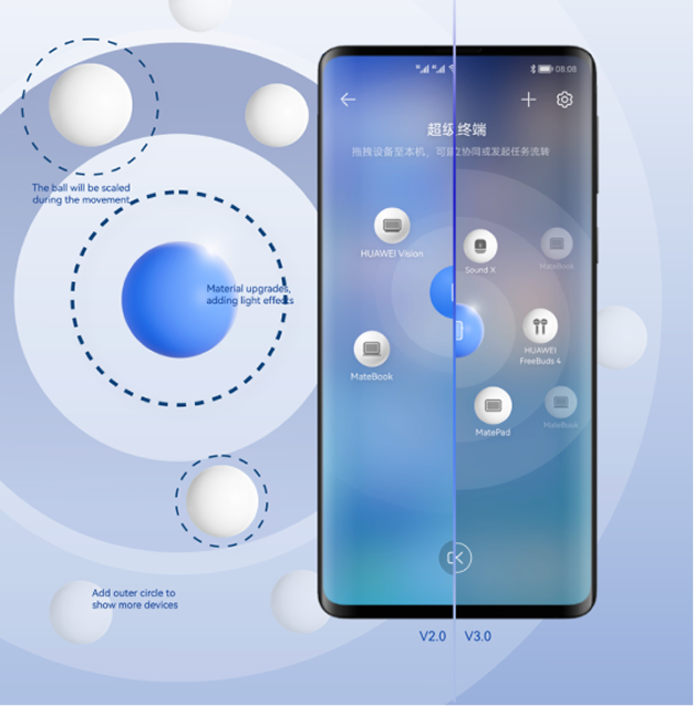
Based on testing feedback, we refined the design to improve intuitiveness, immersion, and overall usability:
- Introduced scaling animations to suggest drag affordance.
- Enhanced material textures and lighting for a premium look.
- Added outer orbit circles to support displaying more connected devices.
Results & User Feedback
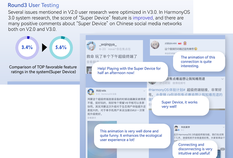
After launching with HarmonyOS 3.0 (2021), user testing showed significantly improved satisfaction with the Super Device feature.
- Positive comments praised the updated animations and clearer interaction.
- Satisfaction scores increased from 3.4 to 5.6 (out of 6).
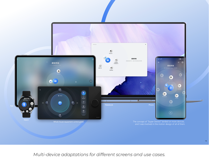
In later HarmonyOS versions (2022–2023), we extended this design to other device types - including tablets, TVs, and watches. I contributed the adaptation work for these screens, ensuring consistent interaction patterns and visual quality across different sizes and functions (details not expanded here).
